Wikipedia:Featured picture candidates/Strasbourg Cathedral facade
Appearance

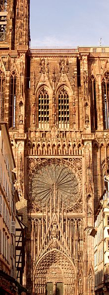
Self-nomination. I took two photos of the cathedral's façade and then stitched them together in Photoshop. The Strasbourg cathedral is one of the most remarkable examples of Gothic architecture in France. --[[User:Kpalion|Kpalion (talk)]] 18:21, 3 Dec 2004 (UTC)
- Weak Oppose. Either because of the compression of the image or becasue of the buildings surface, the image doesn't look all that clear.--Fir0002 23:07, 4 Dec 2004 (UTC)
- Weak oppose - just as Photoshop can be used to stitch, so too can it be used to adjust perspective. Would support if that were done. Denni☯ 23:47, 2004 Dec 4 (UTC)
- Support. It's detailed and beautiful. - Menchi 08:11, 5 Dec 2004 (UTC)
- Ooo...I didn't notice the door was missing its bottom bits like Solipsist pointed out. I can live with the fact the higher tower to the left is missing its roof, but the gate's lower part being missing is a bit of a shame. I still support, since no other featured church photo has a facade. Strangely, we have two similar ones on the inside though: Image:Cathedral of Magdeburg Inside.jpg and Image:STmaximin-Solitude.jpg --Menchi 00:29, 6 Dec 2004 (UTC)
- Support. Insanely detailed. - RedWordSmith 19:38, Dec 5, 2004 (UTC)
- Oppose. Pretty good, but... It can be difficult to get a good angle on some cathedrals, particularly when enclosed by medieval streets, so it is often necessary to concentrate on the tower/spire or one of the doorways. In this case, although the facade is reasonably detailed, we are missing both the top and the bottom, which feels uncomfortable. Also, there is hardly any article to illustrate at Our Lady's Cathedral in Strasbourg (nor on the French Wiki from what I could tell). Its a reasonable illustration for façade, but I would have thought we could find better - for a cathedral it should probably be the west face, and for any building should really be complete elevation. -- Solipsist 21:57, 5 Dec 2004 (UTC)
- Oppose --ScottyBoy900Q∞ 00:04, 06 Dec 2004 (UTC)
- Oppose. Janderk 14:17, 6 Dec 2004 (UTC)
- Support. Nice picture but... hm, not ideal. Could you make the sky more dark in Photoshop. In the future use filters. tukan 16:54, 13 Dec 2004 (UTC)
- Oppose. Nice job stitching, but the tight crop on all four sides is confining. - Jpo 18:46, Dec 13, 2004 (UTC)
- Oppose. Like many images of architecture on WP, it needs perspective correction, at the very least. --MarkSweep 19:15, 13 Dec 2004 (UTC)
- Oppose. Enochlau 15:36, 17 Dec 2004 (UTC)
